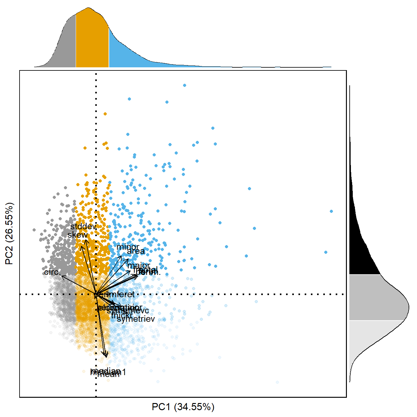
A PCA was run on the morphological features for each vignette. A weighted PCA was used to adjust for any bias from uneven sampling by the UVP. Principle components with eigenvalues greater than 1 were considered. This comprised the first four PCs, which explained a total of 87.9% of the variance in the data (view the complete PCA results check supplemental information 2. The first two components explained 34.23% and 27.24% respectively. The first principle component was largely correlated with metrics associated with size (perimeter, feret diameter, fractal dimension, major axis). The second principle component is best described by darkness, where positive values indicate more transparent organisms and negative values are darker ones. Similar to Vilgraine et al. (2020), we observe the third PC to be best described by orientation and the fourth axis to be described by appendage visibility. It can be assumed that the orientation and appendage visibility of copepods are artefacts of the imaging method and not indicative of their ecology/behavior. For this reason, we chose to only consider the first two PC’s when assessing our hypotheses. However, because of uneven sampling throughout the water column, it is not feasible to directly draw associative relationships between the continuous PC’s and depth. We elected to construct discrete groups of copepods based on the morphospace. To address the size-dependent hypothesis, groups were assigned as low, mid, or high. Then to assess if color/transparency was a secondary factor once having accounted for size, groups within each PC1 group were assigned as low, mid, or high along PC2. The low group corresponded to those that were below the 25th percentile of the PC, mid group was the middle 50% of all observations, and the high group was above the 75th percentile.
Code
# |- Extract variable contributions ----------------------------pc_df <-data.frame(pc1 = pca_results$var$coord[,1],pc2 = pca_results$var$coord[,2],pc3 = pca_results$var$coord[,3],pc4 = pca_results$var$coord[,4],vars =row.names(pca_results$var$coord))# To generate figure plot:pc_main <-ggplot()+geom_point(data = pca_cope, aes(x = PC1*.1,y = PC2*.1,fill =as.factor(pc1_class),color =as.factor(pc1_class),alpha =as.factor(pc2_class)),size =1.5) +geom_hline(yintercept =0, color ='black', size =1, linetype ='dotted')+geom_vline(xintercept =0, color ='black', size =1, linetype ='dotted')+scale_color_manual(values =gg_cbb_col(3))+scale_fill_manual(values =gg_cbb_col(3))+scale_alpha_manual(values =c(0.1,.25,1))+geom_text(data = pc_df, aes(x = pc1*.5, y = pc2*.5, label = vars),position =position_jitter(), color ='black') +geom_segment(data = pc_df,aes(x =0, y =0, xend = pc1*.4, yend = pc2*.4),arrow =arrow(length =unit(1/2, 'picas')), color ="black") +labs(x =paste0('PC1 (',round(pca_results$eig[1,2],2),'%)'),y =paste0('PC2 (',round(pca_results$eig[2,2],2),'%)'))+theme_pubr()+theme(legend.position ='none',axis.line =element_blank(),panel.background =element_blank(),panel.grid =element_blank(),axis.text =element_blank(),axis.ticks =element_blank())xdensity <-ggplot(pca_cope)+geom_density(aes(x = PC1*.1))sub_x <-ggplot_build(xdensity)$data[[1]]xmargin <- xdensity+geom_area(data =subset(sub_x, x <quantile(pca_cope$PC1*.1, probs = .25)), aes(x = x, y=y), fill =gg_cbb_col(1)[1]) +geom_area(data =subset(sub_x, x >=quantile(pca_cope$PC1*.1, probs = .25) & x <=quantile(pca_cope$PC1*.1, probs = .75)),aes(x = x, y=y), fill =gg_cbb_col(2)[2]) +geom_area(data =subset(sub_x, x >quantile(pca_cope$PC1*.1, probs = .75)), aes(x = x, y=y), fill =gg_cbb_col(3)[3])+theme_void()ydensity <-ggplot(pca_cope)+geom_density(aes(x = PC2*.1))sub_y <-ggplot_build(ydensity)$data[[1]]ymargin <- ydensity+geom_area(data =subset(sub_y, x <quantile(pca_cope$PC2*.1, probs = .25)), aes(x = x, y=y), fill ='black', alpha = .1) +geom_area(data =subset(sub_y, x >=quantile(pca_cope$PC2*.1, probs = .25) & x <=quantile(pca_cope$PC2*.1, probs = .75)),aes(x = x, y=y), fill ='black', alpha = .25) +geom_area(data =subset(sub_y, x >quantile(pca_cope$PC2*.1, probs = .75)), aes(x = x, y=y), fill ='black', alpha =1)+theme_void() +coord_flip()pc_main <- pc_main+border()+xlim(layer_scales(xmargin)$x$range$range)+ylim(layer_scales(ymargin)$x$range$range)px <-insert_xaxis_grob(pc_main, xmargin, grid::unit(.2, "null"), position ="top")py <-insert_yaxis_grob(px, ymargin, grid::unit(.2,'null'), position ='right')ggdraw(py)
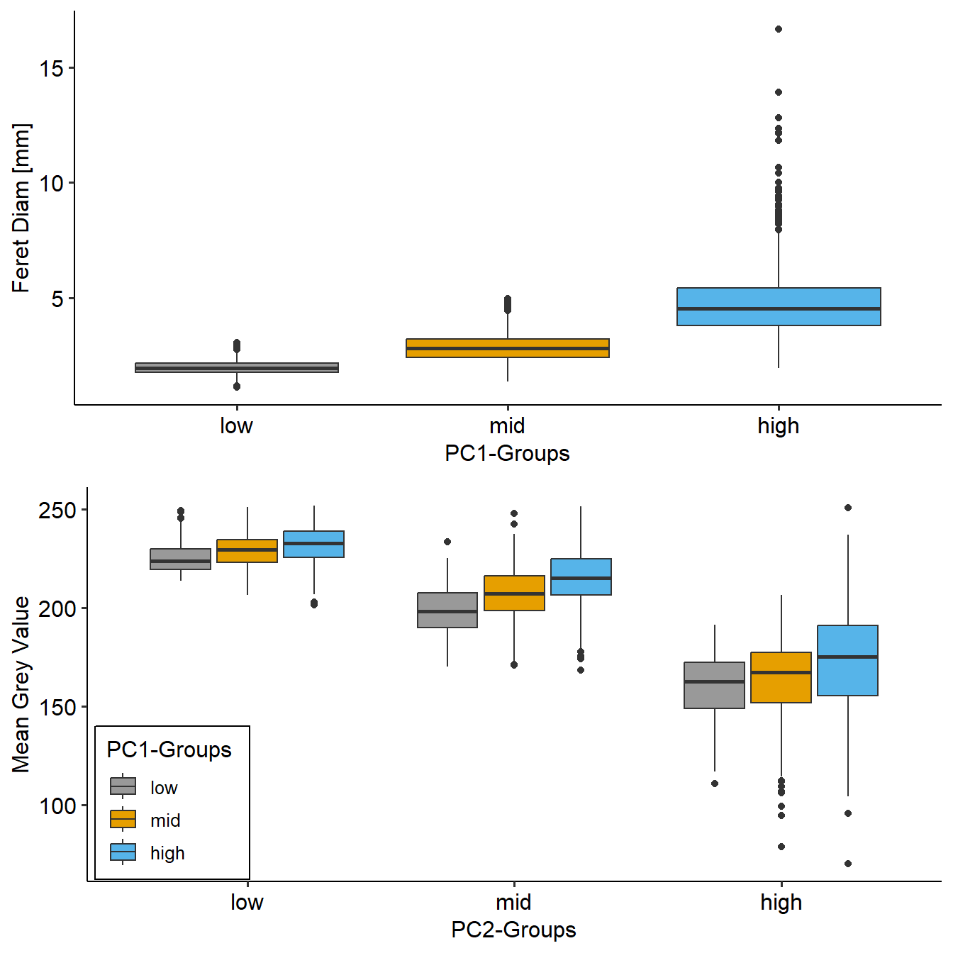
To assure that the morphological groups created were different along ecologically relevant metrics, the groups were compared against known metrics which are meaningful to copepod morphology. The three size groups along PC1 were compared using feret diameter and the groups along PC2 were assessed using the mean grey value.
Across all PC1-groups, there was a clear difference in feret diameter. The median feret diameter of the low group is 1.9708937 mm. The median feret diameter of the mid and high groups are 2.8379297mm and 4.8253025mm, respectively. All groups were significantly different from one another (Dunn Krustall-wallace test, p < 0.001). PC2 groups as a whole were also significantly different from one another (Dunn Krustall-wallace test, p < 0.001). However, within each PC2-group, there was a clear tendency for larger copepods (PC1-groupings) to be lighter. This phenomena is likely due to the ease of identifying a more transparent copepod if it is larger. This justifies the comparison of PC2-groups to be within a PC1-group - so that the effect of transparency on copepod DVM is separated from the effect of size.
Source Code
---title: 'Morphogroup Definition'---```{r}rm(list =ls())library(DT)library(EcotaxaTools)library(ggplot2)library(ggpubr)library(cowplot)source('../R/tools.R')pca_cope <-readRDS('../data/02_PCA-copepods.rds')pca_results <-readRDS('../data/02_cope-pca-res.rds')uvp_data <-readRDS('../data/01_uvp-trim-final_large.rds') |>trim_to_cope()# |- Assign percentiles of morphogroups -----------------pca_cope$PC1_percentile <-sapply(pca_cope$PC1, function(x) ecdf(pca_cope$PC1)(x))pca_cope$PC2_percentile <-sapply(pca_cope$PC2, function(x) ecdf(pca_cope$PC2)(x))# |- Assign morphogroups --------morpho_switch <-function(x) {if(x < .25) {return('low') } elseif (x < .75) {return('mid') } else {return('high') }}pca_cope$pc1_class <-sapply(pca_cope$PC1_percentile, morpho_switch)pca_cope$pc2_class <-sapply(pca_cope$PC2_percentile, morpho_switch)pca_cope$pc1_class <-factor(pca_cope$pc1_class, levels =c('low','mid','high'))pca_cope$pc2_class <-factor(pca_cope$pc2_class, levels =c('low','mid','high'))```# MethodologyA PCA was run on the morphological features for each vignette. A weighted PCA was used to adjust for any bias from uneven sampling by the UVP. Principle components with eigenvalues greater than 1 were considered. This comprised the first four PCs, which explained a total of 87.9% of the variance in the data (view the complete PCA results check [supplemental information 2](./supp_02_pc-extended-info.html). The first two components explained 34.23% and 27.24% respectively. The first principle component was largely correlated with metrics associated with size (perimeter, feret diameter, fractal dimension, major axis). The second principle component is best described by darkness, where positive values indicate more transparent organisms and negative values are darker ones. Similar to Vilgraine et al. (2020), we observe the third PC to be best described by orientation and the fourth axis to be described by appendage visibility. \n\n It can be assumed that the orientation and appendage visibility of copepods are artefacts of the imaging method and not indicative of their ecology/behavior. For this reason, we chose to only consider the first two PC's when assessing our hypotheses. However, because of uneven sampling throughout the water column, it is not feasible to directly draw associative relationships between the continuous PC's and depth. We elected to construct discrete groups of copepods based on the morphospace. To address the size-dependent hypothesis, groups were assigned as low, mid, or high. Then to assess if color/transparency was a secondary factor once having accounted for size, groups within each PC1 group were assigned as low, mid, or high along PC2. The low group corresponded to those that were below the 25th percentile of the PC, mid group was the middle 50% of all observations, and the high group was above the 75th percentile.\n\n```{r, fig.width=7, fig.height=7, out.width='100%', out.height='100%'}# |- Extract variable contributions ----------------------------pc_df <-data.frame(pc1 = pca_results$var$coord[,1],pc2 = pca_results$var$coord[,2],pc3 = pca_results$var$coord[,3],pc4 = pca_results$var$coord[,4],vars =row.names(pca_results$var$coord))# To generate figure plot:pc_main <-ggplot()+geom_point(data = pca_cope, aes(x = PC1*.1,y = PC2*.1,fill =as.factor(pc1_class),color =as.factor(pc1_class),alpha =as.factor(pc2_class)),size =1.5) +geom_hline(yintercept =0, color ='black', size =1, linetype ='dotted')+geom_vline(xintercept =0, color ='black', size =1, linetype ='dotted')+scale_color_manual(values =gg_cbb_col(3))+scale_fill_manual(values =gg_cbb_col(3))+scale_alpha_manual(values =c(0.1,.25,1))+geom_text(data = pc_df, aes(x = pc1*.5, y = pc2*.5, label = vars),position =position_jitter(), color ='black') +geom_segment(data = pc_df,aes(x =0, y =0, xend = pc1*.4, yend = pc2*.4),arrow =arrow(length =unit(1/2, 'picas')), color ="black") +labs(x =paste0('PC1 (',round(pca_results$eig[1,2],2),'%)'),y =paste0('PC2 (',round(pca_results$eig[2,2],2),'%)'))+theme_pubr()+theme(legend.position ='none',axis.line =element_blank(),panel.background =element_blank(),panel.grid =element_blank(),axis.text =element_blank(),axis.ticks =element_blank())xdensity <-ggplot(pca_cope)+geom_density(aes(x = PC1*.1))sub_x <-ggplot_build(xdensity)$data[[1]]xmargin <- xdensity+geom_area(data =subset(sub_x, x <quantile(pca_cope$PC1*.1, probs = .25)), aes(x = x, y=y), fill =gg_cbb_col(1)[1]) +geom_area(data =subset(sub_x, x >=quantile(pca_cope$PC1*.1, probs = .25) & x <=quantile(pca_cope$PC1*.1, probs = .75)),aes(x = x, y=y), fill =gg_cbb_col(2)[2]) +geom_area(data =subset(sub_x, x >quantile(pca_cope$PC1*.1, probs = .75)), aes(x = x, y=y), fill =gg_cbb_col(3)[3])+theme_void()ydensity <-ggplot(pca_cope)+geom_density(aes(x = PC2*.1))sub_y <-ggplot_build(ydensity)$data[[1]]ymargin <- ydensity+geom_area(data =subset(sub_y, x <quantile(pca_cope$PC2*.1, probs = .25)), aes(x = x, y=y), fill ='black', alpha = .1) +geom_area(data =subset(sub_y, x >=quantile(pca_cope$PC2*.1, probs = .25) & x <=quantile(pca_cope$PC2*.1, probs = .75)),aes(x = x, y=y), fill ='black', alpha = .25) +geom_area(data =subset(sub_y, x >quantile(pca_cope$PC2*.1, probs = .75)), aes(x = x, y=y), fill ='black', alpha =1)+theme_void() +coord_flip()pc_main <- pc_main+border()+xlim(layer_scales(xmargin)$x$range$range)+ylim(layer_scales(ymargin)$x$range$range)px <-insert_xaxis_grob(pc_main, xmargin, grid::unit(.2, "null"), position ="top")py <-insert_yaxis_grob(px, ymargin, grid::unit(.2,'null'), position ='right')ggdraw(py)# ggsave('../media/raw_figure_01.pdf',height = 180,# width = 180, units = 'mm', dpi = 600)```\n\n## Morphogroup definition separationTo assure that the morphological groups created were different along ecologically relevant metrics, the groups were compared against known metrics which are meaningful to copepod morphology. The three size groups along PC1 were compared using feret diameter and the groups along PC2 were assessed using the mean grey value.```{r, fig.width=7, fig.height=7, out.width='100%', out.height='100%'}##### Assign Clusters to individuals ############for(i in1:length(uvp_data$zoo_files)) { idx <-which(pca_cope$orig_id %in% uvp_data$zoo_files[[i]]$orig_id) uvp_data$zoo_files[[i]]$pc1_class <- pca_cope$pc1_class[idx] uvp_data$zoo_files[[i]]$pc2_class <- pca_cope$pc2_class[idx]}all_copes <- uvp_data$zoo_files |>list_to_tib('profileid')# convert to mmall_copes$feret <- all_copes$feret *unique(uvp_data$meta$acq_pixel)feret_plot <-ggplot(all_copes) +geom_boxplot(aes(x =as.factor(pc1_class),y = feret,fill =as.factor(pc1_class))) +scale_fill_manual(values =gg_cbb_col(3))+labs(x ="PC1-Groups", y ='Feret Diam [mm]') +theme_pubr()+theme(legend.position ='none')meanGrey_plot <-ggplot(all_copes) +geom_boxplot(aes(x =as.factor(pc2_class),y = mean,fill =as.factor(pc1_class))) +scale_fill_manual(values =gg_cbb_col(3))+labs(x ="PC2-Groups", y ='Mean Grey Value', fill ='PC1-Groups') +theme_pubr()+theme(legend.position =c(.1,.20), legend.box.background =element_rect(),legend.background =element_blank())metric_plot <-ggarrange(feret_plot, meanGrey_plot, ncol =1)metric_plot# ggsave('../media/raw_02_figure.pdf',metric_plot,# width = 80, height = 160, units = 'mm', dpi = 600)```Across all PC1-groups, there was a clear difference in feret diameter. The median feret diameter of the low group is `r mean(all_copes$feret[which(all_copes$pc1_class == 'low')])` mm. The median feret diameter of the mid and high groups are `r mean(all_copes$feret[which(all_copes$pc1_class == 'mid')])`mm and `r mean(all_copes$feret[which(all_copes$pc1_class == 'high')])`mm, respectively. All groups were significantly different from one another (Dunn Krustall-wallace test, p < 0.001).PC2 groups as a whole were also significantly different from one another (Dunn Krustall-wallace test, p < 0.001). However, within each PC2-group, there was a clear tendency for larger copepods (PC1-groupings) to be lighter. This phenomena is likely due to the ease of identifying a more transparent copepod if it is larger. This justifies the comparison of PC2-groups to be within a PC1-group - so that the effect of transparency on copepod DVM is separated from the effect of size.